Aetna
Case Study: Improving Login and Registration Success with Content Design
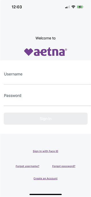
Old Native Login
New Native Login
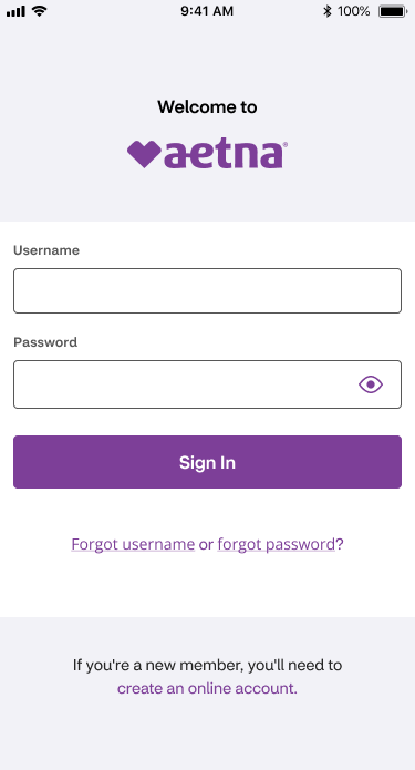
Login: A simplified layout, clearer input labels, and improved support links reduce friction at the entry point.
Old Native Registration
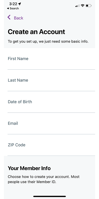
New Native Registration
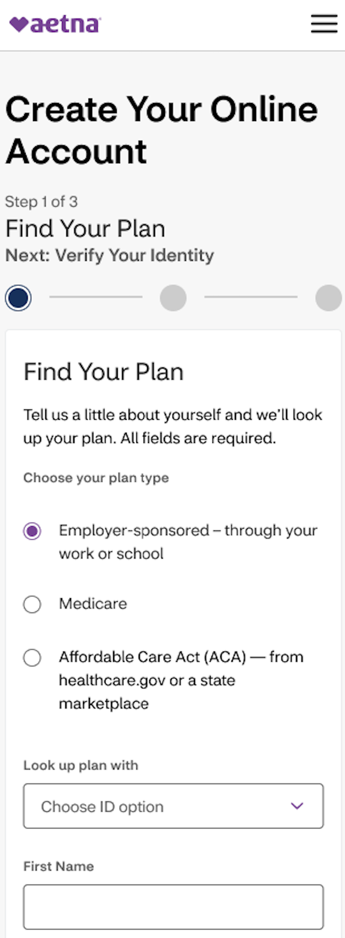
Registration: A new step-based flow and clearer guidance help users complete registration easily.
Project context
This work focused on improving Aetna’s login and registration success rates within a complex, regulated healthcare experience. By redesigning login and registration flows and refining content across key touchpoints, the UX team and I made it easier for users to complete their tasks independently.
Problem I set out to solve
Users were experiencing friction during login and registration. There was unclear error messaging, inconsistent experiences across platforms, and limited guidance during key steps. These challenges led to drop-offs and increased customer support call volume.
My role as Content Designer
Led UX writing and content strategy across login and registration flows.
Partnered with designers, accessibility partners, developers, and the product team.
Defined content patterns for error states, help text, and authentication flows.
Contributed to cross-platform consistency within web and native.
Collaboration
This work required close collaboration with designers, accessibility partners, developers, and the product team. Our goal was to balance user needs with business goals, on time and on budget.
Process
First, the UX team and I met with our product team to gather requirements and understand the problem space.
Designers and I began discovery by thoroughly researching competitors, learning updated best practices, and most importantly listening to users’ challenges firsthand.
We assembled the login and registration work feature by feature. Design iterations began with wireframes, then ultimately led to low- and high-fidelity prototypes.
Finally, we annotated work for developers and worked hand-in-hand with them as they completed the work.
User testing: We tested our work throughout the process to ensure our content was clear and our designs were easy to navigate.
Content strategy and key content improvements
Contextual error messaging: I replaced vague system errors with actionable, user-centered guidance to help users recover quickly.
Self-service support: I introduced improved help content and inline guidance to reduce dependency on customer support.
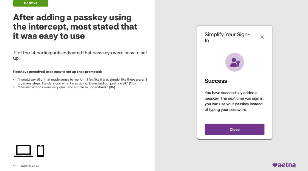
Authentication clarity: We integrated 2FA (two-factor authentication) messaging into the flow with clear expectations and instructions.
Accessibility and inclusivity: Through our CMS (content management system), I delivered alt text and Spanish translations to assist all users.
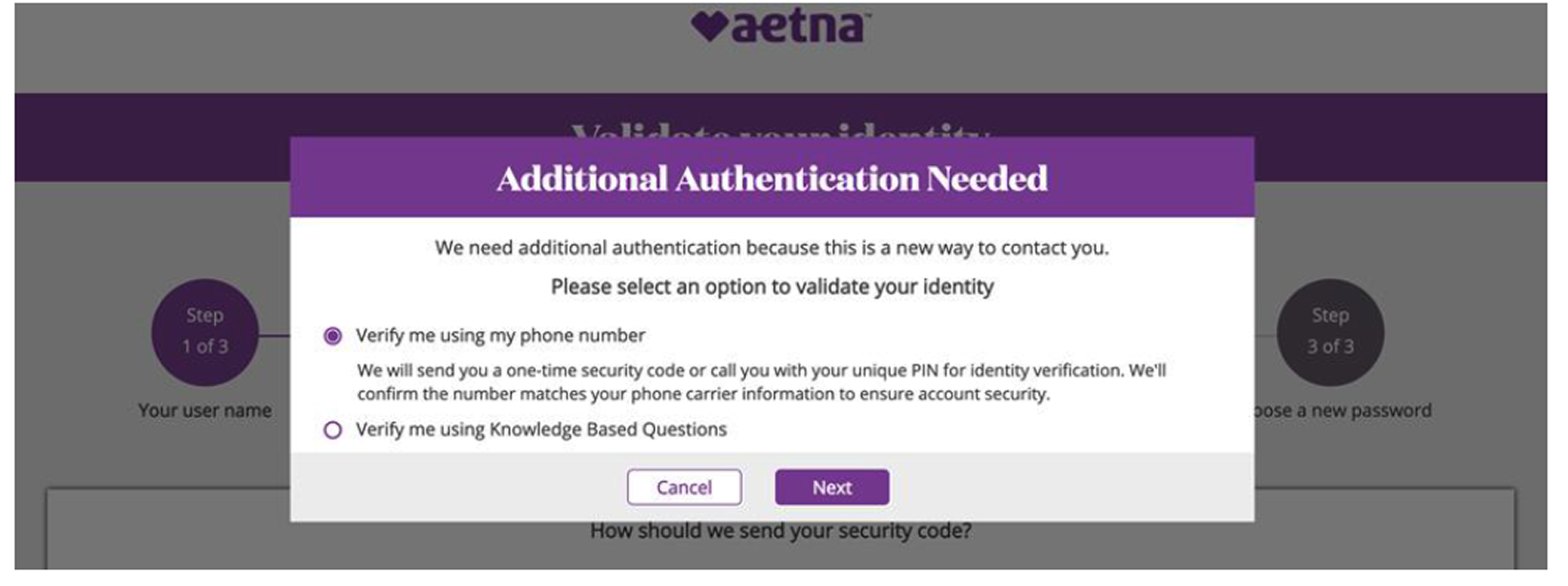
Before: Users were presented with multiple verification paths and technical language. This screen created friction and slowed down decision-making during a critical step in the login process.
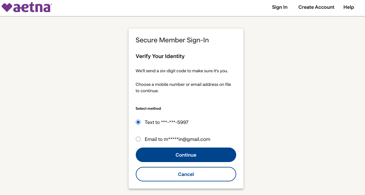
After: I streamlined this screen by prioritizing a single, guided action and rewriting content to be clearer and more user-centered. These changes reduced cognitive load and improved completion rates overall.
Impact
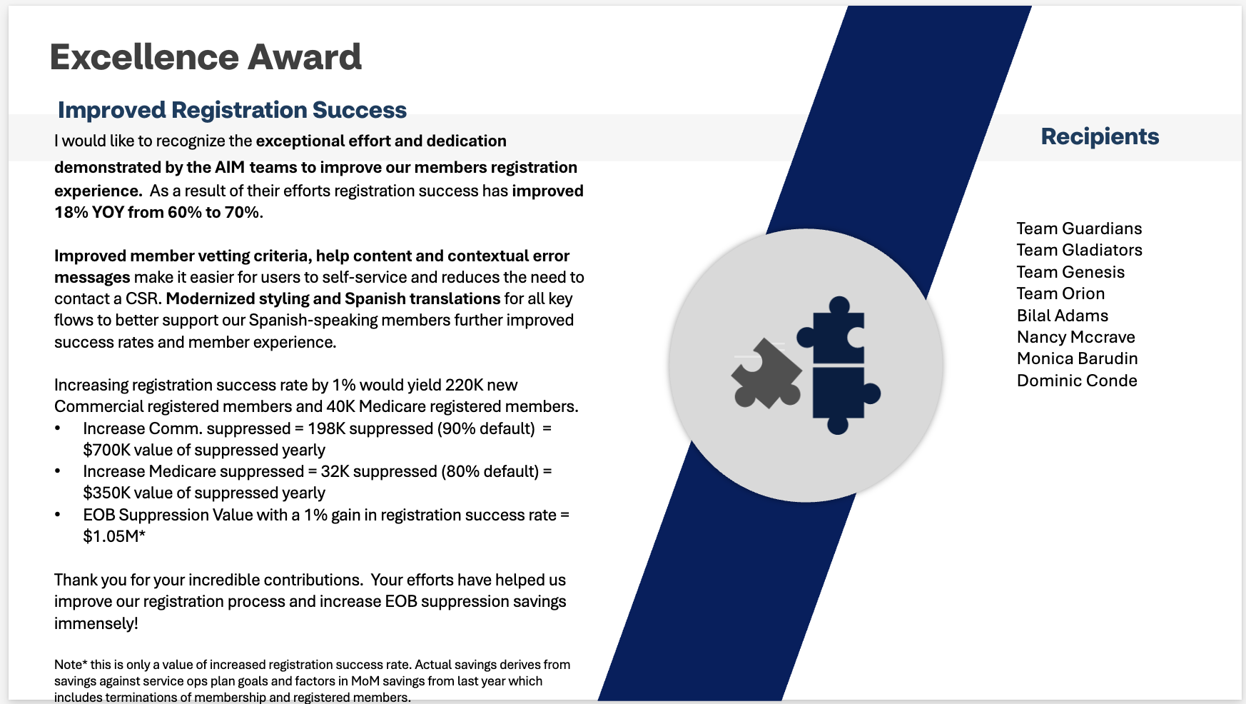
This work resulted in +18% YOY (year-over-year) increase in registration success rate (60% to 70%).
Early rollout of our work showed continued uplift.
Customer support call volume decreased through improved self-service.
We achieved an estimated $1M+ business value.
Even a 1% increase in registration success translated to significant business value.
Lessons learned
Content design changes, especially in high-friction moments like login and registration, can drive measurable improvements in both user experience and business goals.